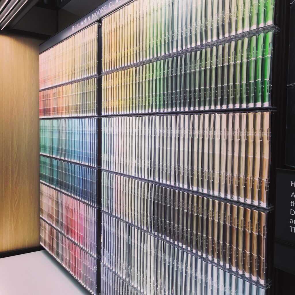
Hello! We are talking paint today, specifically how to choose that perfect paint color in the correct shade. It is a question we are often asked, especially when the choices feel infinite. Here are FIVE considerations to help you narrow it down:
#1 INSPIRATION: Pull all your Pins together…what do they have in common? Is there a color you favor or a particular shade you are drawn to? You can also look at your wardrobe- what colors do you lean toward? Often times our preferences with what we choose to wear translate into our preferences for home decor.
#2 LIGHTING: How much natural light does your room get? Apply samples to different areas of the room to determine how it will look during different times of day as the light changes.
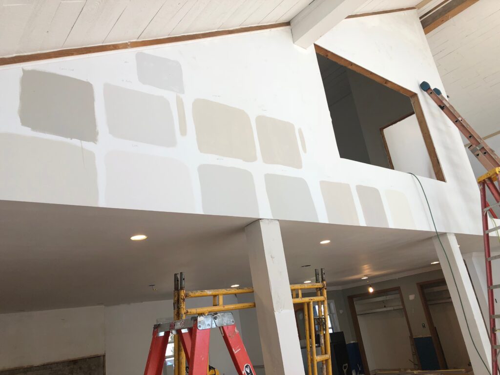
#3 ADJACENT SPACES: Will the room you are choosing paint for be open or viewable from an adjacent space? Evaluating how the color transitions from one space to the next is critical for ensuring the visual flow of the design. Consider similar color tones when transitioning from one room to the next.
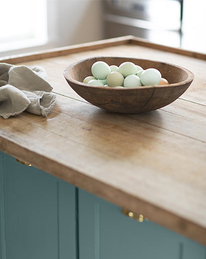
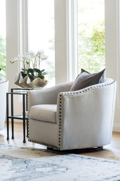
#4 ITEMS IN THE SPACE: What items will be in the space? Are there special pieces of art you are going to use in your project? Will the wall color you are considering work as a backdrop to those pieces? What about textiles- linens for a bedroom or pillows and window treatments in a living room…what paint colors would pair well with them?
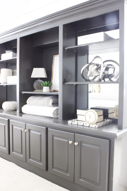
#5 UNDERTONES: Anyone who has ever searched for that perfect gray paint color is aware of the power of undertones. Without getting into an entire color theory discussion, the undertone of a color impacts how it will appear in the room. Grays for example, may have a blueish undertone or some may read more green, or even purple. Consider the temperature of the color in order to narrow it down. That perfect white shade you are looking for may have blue or green undertones and be a bit cooler, or may have warmer undertones like yellows.
Regardless of what colors you are leaning toward, it is best to sample the color in different areas of the room to account for changing lights and shadows. I used to have more cans of sample paint than I care to admit, so I now order 12 x 12 swatches from Samplize. This is not an ad, just a PSA. It saves time, mess, and the accumulation of those little cans of “too much color that didn’t work out“.
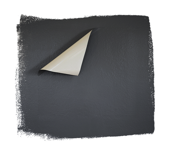
Samplize prints the actual paint onto large swatch decals that can be applied directly to the wall. I typically cut one swatch into four and place them in different areas of the room to assess the color in varying lights. Right now they print colors from the following companies: Benjamin Moore, Sherwin Williams, PPG and Farrow & Ball. Most orders ship the same day, so if you choose options at the beginning of the week, odds are you will have your samples by the weekend, in time to start your project.
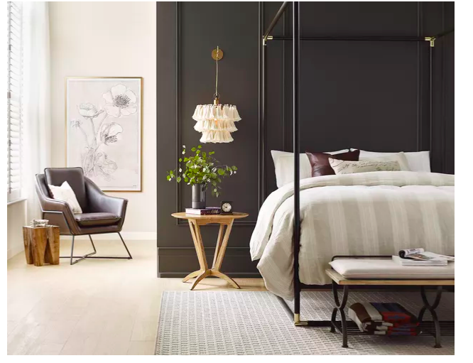
And, because I follow these things, I also wanted to share with you that Sherwin Williams color of the year for 2021 is…. drumroll please… Urbane Bronze (SW7048), a warm gray/brown neutral color.
Farrow & Ball went toward earthy, calming colors and created a 2021 palette that you can see here. PPG also created color palettes, focused on “softened hues” to “serve as release for (the) over-stimulated weary customer.” Sounds about right having lived through the last 8 months of 2020… The PPG palette can be seen here.
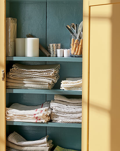
Benjamin Moore also unveiled a complete color palette for 2021, but their color of the year is Aegean Teal (2136-40), which they describe as intriguing, balanced and deeply soothing.
There are so many paint color options to create beautiful spaces where memories are made. Let us know if we can help you with your next project!
XO,
Kelly
